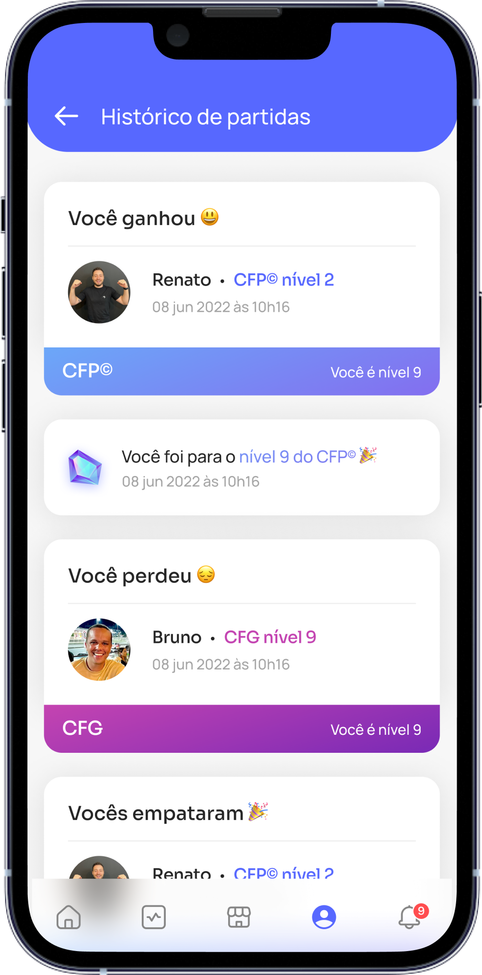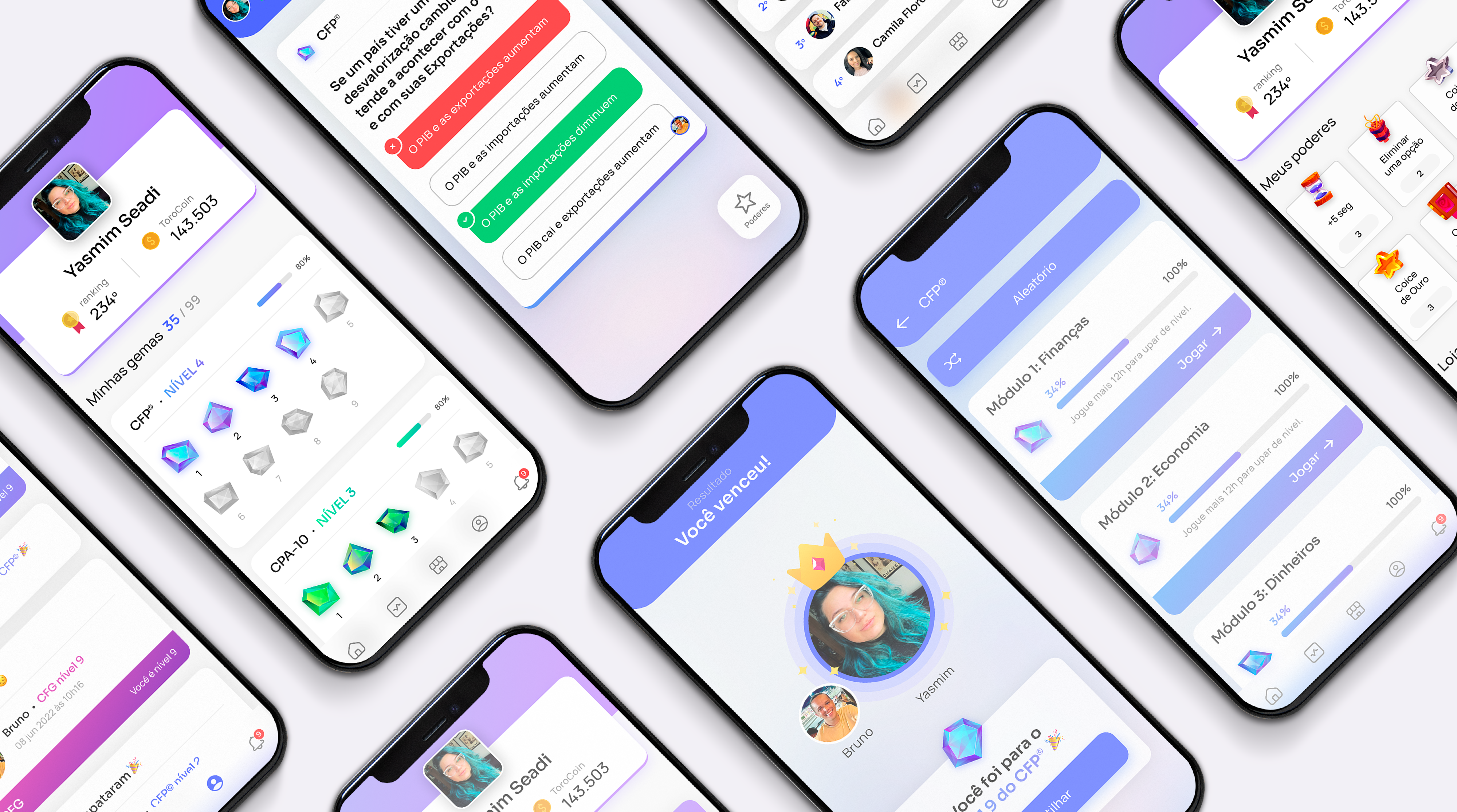
Previously, the application failed to convey the impression of being a game, appearing more like a web browser hosting an online game.
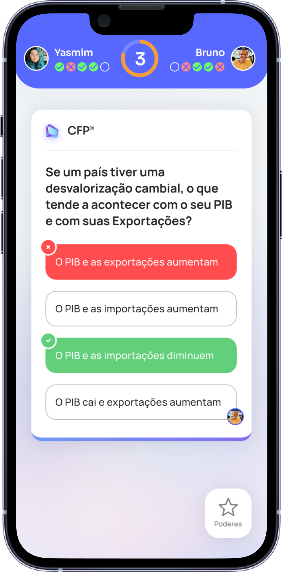
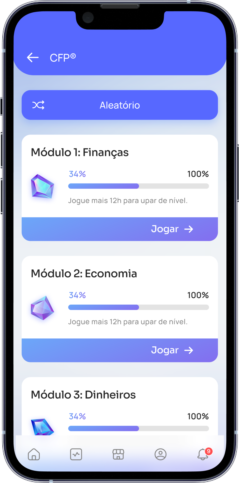
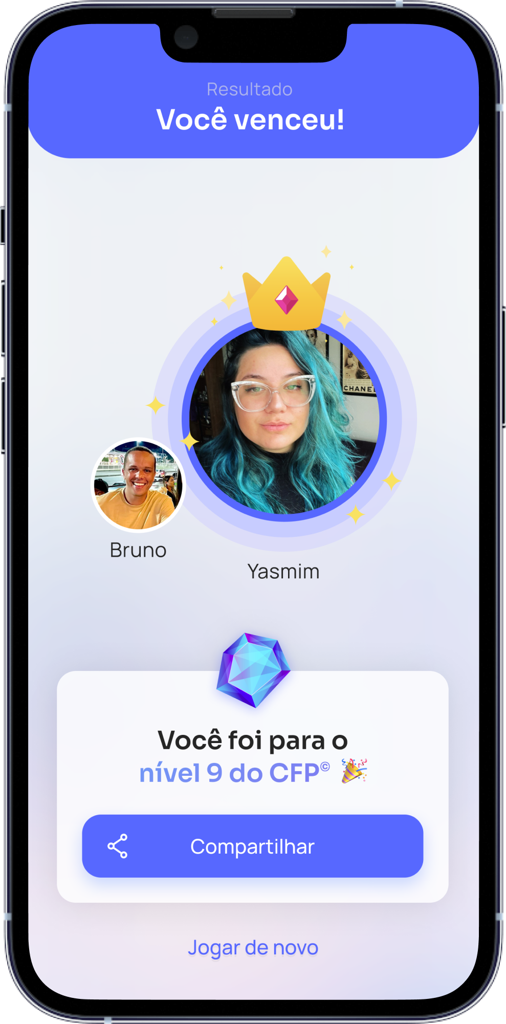
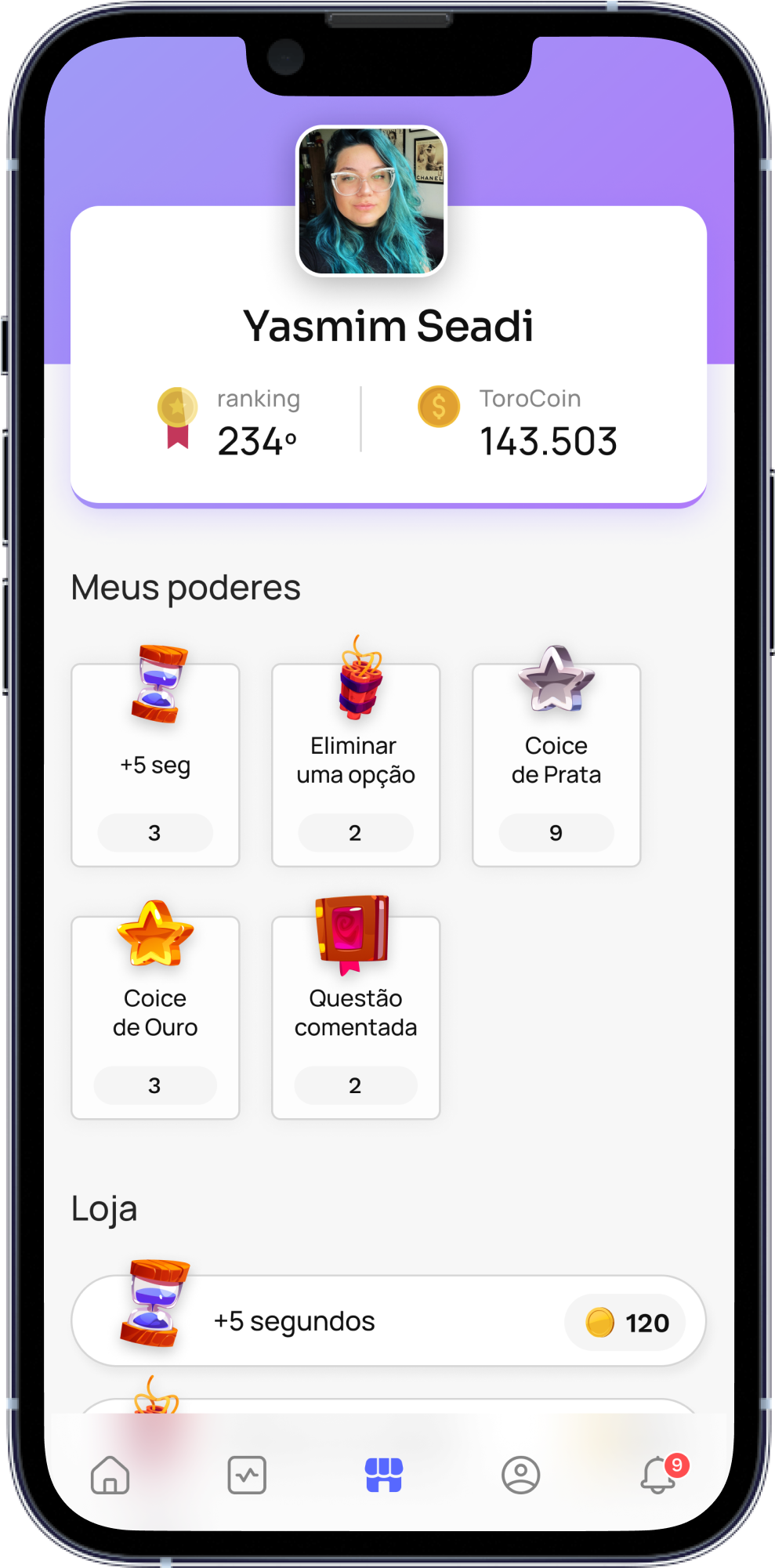
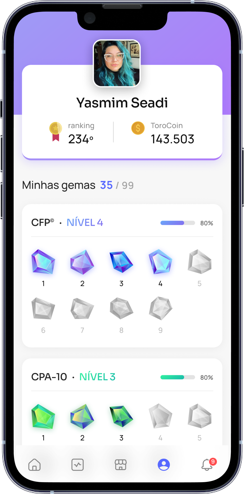
My proposal in the redesign was to create a gaming environment with gems representing each certification, which would boost user engagement. The different colors indicate different certifications, and the gems represent the various levels of proficiency. In addition, we introduced a store in the new version where users could purchase powers to aid them during gameplay, such as extending the time to answer a question or removing an option.